CEO Blog - Advice for CEOs on growth and scaling
Creating a Logo 101

Branding began with cattle during the Industrial Revolution. The more goods people produced, the more they needed a simple way to identify ownership. If you knew that John Smith had the best cows in the village, how could you find his cuts at the city butcher? How to know which cow was which, who it belonged to, how it was raised? People started branding cows with paint or pine tar or, yikes, hot iron. Perhaps not a cheery picture, but the most memorable logos of today could be easily converted to a traditional cow brand. Nike. Target. NBC. McDonalds. Playboy. What do all of them have in common? They are very simple and they use primary colors.

Your logo has to be simple, straightforward and bold.
Simple colors, simple shapes. It has to be recognizable anywhere, in big print, in small print, on textile, digitally. It has to stay recognizable even when it’s shrunk to the size of your pinky nail and stripped of color. Humans are hard-wired to detect patterns and colors in nature. In a tropical jungle and afraid of man-eating tigers? Your brain doesn’t look for a tiger – it looks for stripes and orange color. We are surrounded by visual noise and are bombarded with pictures every day. How do you create a logo that can break through this noise and make us take notice?
- Pick colors.
Take a lesson from the world’s most memorable brands: use bright primary colors on a white background with a maximum of one accent color. For example, use blue (confidence) and red (power, strength) – both of which are specifically suitable for B2B (business to business) marketing. Research your colors. They have meanings. What would you think of a funeral home that had a logo of a pink oval? You’d raise your brows. Pink is not a smart choice for a respectable establishment that dealing with grief. How about purple? In Western culture it was a symbol of royalty, but did you know that in Thailand purple signifies mourning? Consider your audience. What color would speak to them and what would it mean?
Don’t worry about using colors that everyone else is using. After all, how many blue and red logos are out there? A lot. So what? There are as many tonalities and combinations possible with an infinite number of shapes that are at your disposal.
- Make shapes.
An effective logo consists of a mark and a logotype. The mark is the icon and the logotype is the name of your company. Together they make up your company’s signature. In a way, it’s your face and your name, this is how we associate with entities around us. For your image pick simple geometrical shapes. Circles, squares, triangles. Or pick outlines of recognizable symbols or objects. You can’t go wrong if you err on the simple side, but you run the risk of losing your image in the visual noise if you try to be too complicated. Stick to something that has potentially nothing to do with what your company does but everything with its name (think Apple). The farther away is the image, the stronger will be the association in the customer’s mind.
Just as colors have certain associations, certain shapes send out specific messages. Here are some of the psychological effects that have been proven:
- Ovals, Circles and Ellipses project a mostly positive emotion. Circles suggest friendship and unity. Rings imply partnership and suggest stability. Curves are viewed as feminine.
- Squares and other straight edged shapes not only relay stability but also balance. Straight lines and exact logo shapes go together with professionalism, strength and efficiency. Wild colors can become uninviting.
The implications of shape also extend to the typefaces, usage of the logo and product design. Once again, create the shape of your logo with the target audience in mind.
Duplication? It’s really no trouble if you use a logo similar to one already existing, as long as you are not in the same business.
 |
 |
 |
 |
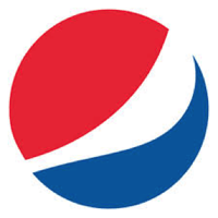
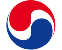
Take a look at Pepsi and Korean Air. Both are circles, both have the top part colored red, the bottom part blue. Both have a white swirl in the middle. Or Acumatica and Ally bank. No conflict at all since these are completely different businesses. If anything, it often confirms you have picked a good logo if there are others that use it too.
- Judge a logo.
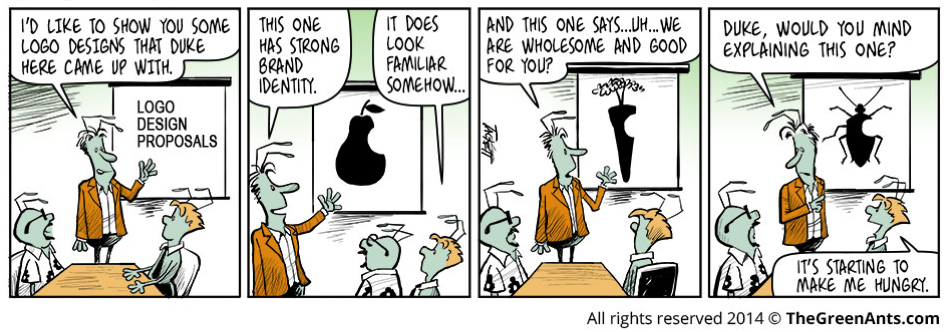
Let’s say you’ve settled on a shape and the colors and the fonts. Great. Take a week off. Your first impression is not important. The logo you are creating has to last, and you have to cool off from your excitement. Most likely what you'll love at first, after a week will look too complicated, noisy or boring. Great logos often don’t get early praise, but when they grow on you, they become really powerful. Give it time, then test it on different people. Pick people who might give you the most unexpected feedback, like your uncle, or your colorblind friend from college, or your neighbor who breeds green ants and likes only the color green, or the gang of teenagers standing at the bus stop and giving you weird looks. Listen to people. Ask them what they see in your image. Don’t make the faux pas AirBnB did with their rebranding. A whole team of smart, creative people missed what so many noticed as soon as the new logo was released. It reminded people, plain and simple, of a certain female organ. How did they miss it? Don’t make this mistake. Listen to people of all walks. If 8 out of 10 people tell you the same thing, you probably need to make a change. Remember, beauty is in the eye of the beholder.
- Build a style guide.
Don’t squirm at this idea. Yes, it’s important to invest your time in building your product, but it’s as important to invest it in your company’s image from the start to build a lasting brand. You have to be consistent. Your image is everything. When you start out, you’re small, you’re a green ant. Nobody knows anything about you. How do you help people notice you and appear bigger than you actually are? Be consistent and professional. Consistency is critical to making your identity easy to re-use, scale and reproduce.
To recap, here is your to-do list:
- Pick one main and one secondary (highlight) color. Research and learn their meanings. Use tools like this fantastic Color Wheel from Adobe to find great combinations by applying specific color rules and guidelines. Here are some good instructions to use your new color palette to create a PowerPoint template.
- Pick a simple shape that goes with the colors. Research it to eliminate accidental references. This article provides more feedback on the science behind great logo design.
- Draw a logo and let it sit for a week before you judge it. Get feedback from a variety of people from all walks of life, but listen especially close to your target audience.
- Build a style guide for everyone to use:
- Introduction: your company’s mission, brand promise, brand values, guide importance.
- Identity: your company’s logo, logo space, logo colors, logo misuses, color palettes and gradient use.
- Typography: primary typeface, secondary typeface.
- Graphic elements: graphics, iconography, mark, photography, marketing communications.
- Verbal identity: your company’s brand voice, using your voice, key messages.
Here are examples from MightyCall and Acumatica.
Topics: Brand Management
Tue, Apr 5, 2016- Press Releases
- Careers
- Case Studies
- Marketing Consultant Company
- Marketing Strategy Consultants
- Marketing Plan Consultants
- B2B Marketing Consultants
- Virtual CMO
- Marketing Consultant Outsourcing
- Fractional CMO
- What is a Fractional CMO
- Healthcare Marketing Consultant
- Marketing Consultant Houston TX Texas
- Marketing Consultant Texas TX
- Marketing Consultant Bay Area
- CEO Blog
- Ebooks Plus
- Executive Marketing Consultants
- Product Marketing Consultants
- B2C Marketing Consultants
- Virtual Marketing Consultants
- Senior Marketing Consultants
- Temporary CMO
- Hire a CMO
- Fractional CMO Salary
- Fractional CMO Responsibilities
- Marketing Consultant Austin TX Texas
- Marketing Consultant Dallas TX Texas
- Marketing Consultant San Antonio
- Helping Private Equity
- Private Equity Blog
- Leadership Team
- Privacy Policy
- Business Marketing Consultants
- Strategic Marketing Consultants
- Marketing Technology Consultants
- Sales and Marketing Consultants
- CMO Job Description
- CMO Salary
- Fractional CMO Agency
- Fractional CMO Services
- CPG Marketing Consultant
- Marketing Consultant San Diego
- Partners
Houston, TX 77056
© 2023 Chief Outsiders


